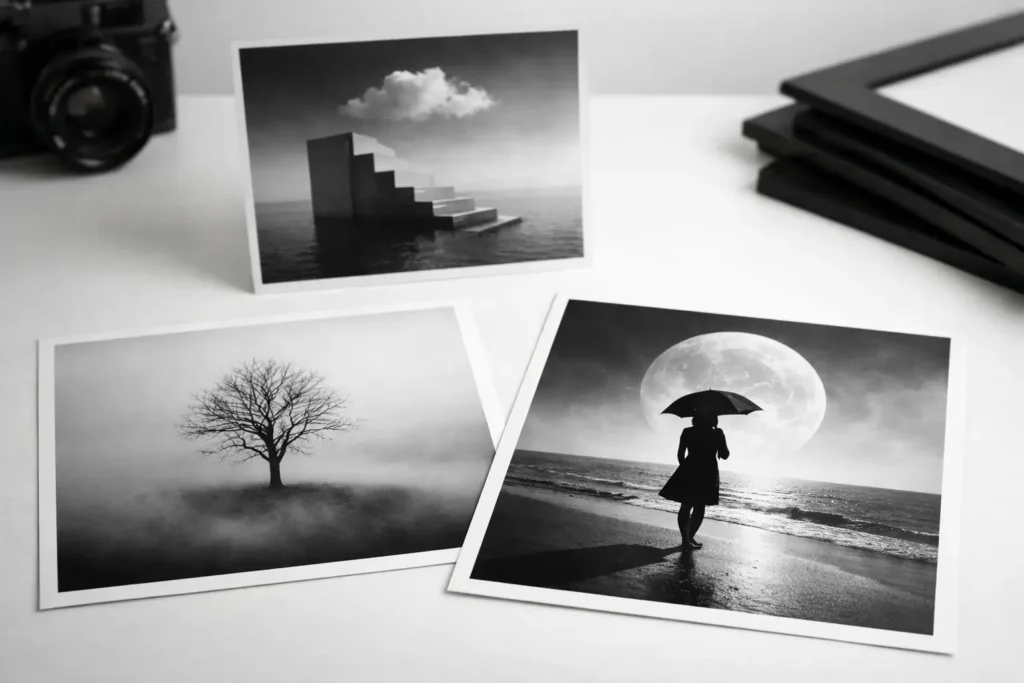
Some prints fill a wall. Others change the temperature of a room. Conceptual black and white photography prints do the second one. They bring tension, silence, attitude, and clarity all at once, which is exactly why they work so well in modern interiors that need more than filler.
This style of art is not about pretty grayscale imagery for the sake of it. It is about ideas translated through contrast. A face hidden in shadow, a surreal gesture, an impossible composition, a symbol placed where it should not be – these choices create visual friction. That friction is what makes a print feel memorable. It asks for a second look, and in a well-designed space, that matters.
Why conceptual black and white photography prints hit harder
Color can be seductive, but black and white is disciplined. It strips an image down to form, contrast, mood, and message. In conceptual photography, that restraint becomes power. Without color pulling attention in ten directions, the viewer notices shape, negative space, expression, and symbolism first.
That is why these prints often feel more sophisticated than literal photographic decor. They do not just show a subject. They frame a thought. A portrait becomes an identity study. An empty chair becomes absence. A blurred hand becomes anxiety, motion, or resistance. The image leaves room for interpretation, and that ambiguity is part of the appeal.
For interiors, this matters because strong spaces need visual hierarchy. Conceptual black and white work holds presence without creating chaos. It can be dramatic, but it stays controlled. It can be emotional, but it still feels clean. That balance is rare.
What makes a print feel conceptual instead of generic
Not every monochrome photo qualifies. A black and white cityscape can be beautiful and still feel predictable. A conceptual print usually carries a clear point of view. There is intention behind the composition, not just technical polish.
Often that intention shows up through visual metaphor. Surreal portraits are a strong example. If the subject is obscured, fragmented, doubled, or placed against an unexpected object, the print starts moving beyond documentation and into interpretation. The same goes for minimal still-life photography with sharp symbolic choices. A single object can say more than a crowded scene if it is framed with precision.
Mood also plays a role. Generic prints tend to feel interchangeable. Conceptual pieces feel authored. They have a distinct emotional register – cold, confrontational, introspective, regal, eerie, or quietly seductive. That emotional clarity is what gives them design value.
Where this style works best
The obvious answer is modern interiors, but that only tells part of the story. Conceptual black and white photography prints work especially well in spaces that already rely on shape, texture, and contrast. Think clean-lined apartments, moody bedrooms, gallery-inspired hallways, creative studios, boutique offices, and dining rooms with a sharper edge.
In minimalist spaces, they prevent the room from feeling flat. In more layered interiors, they act as an anchor. A high-contrast print can cut through velvet, stone, smoked glass, matte black metal, and warm wood without competing with any of them. That flexibility is one of the reasons designers keep returning to monochrome art.
Scale changes the effect. A large-format portrait can dominate a room in the best way. A smaller print in a tight vignette feels more intimate, almost private. Neither is automatically better. It depends on whether the wall needs a statement piece or a controlled accent.
Choosing the right conceptual black and white photography prints for your space
Start with the mood you want, not the wall size. That sounds backwards, but it saves you from buying art that fits physically and misses emotionally. If the room needs calm tension, go for minimal compositions with strong negative space. If it needs more attitude, choose a piece with a confrontational gaze, surreal distortion, or heavier shadow.
The subject matters, but so does the rhythm of the image. Some prints are graphic and architectural. Others are softer and more atmospheric. In a structured interior with hard lines and polished materials, an image with blur or human vulnerability can create the right contrast. In a softer room, a crisp, severe composition can sharpen the whole environment.
Framing should support the image, not dilute it. Black frames feel assertive and gallery-clean. White frames can make a print feel lighter and more editorial. Frameless mounting has its place too, especially in spaces leaning ultra-modern. There is no universal rule here. The better question is whether the presentation amplifies the image’s point of view.
The advantage of downloadable art
This category makes even more sense when it is digital. Conceptual black and white photography prints are detail-driven. Shadow depth, tonal contrast, and sharp composition need resolution that holds up at different scales. High-quality downloadable files give you control over that final result.
There is also a practical edge. You are not locked into one size, one frame, or one finish chosen by someone else. If your entryway needs a tall vertical print and your office needs a wider format from the same visual world, digital files make that possible. The art adapts to the space, not the other way around.
For style-conscious buyers, speed matters too. Waiting weeks for wall art can kill momentum when you are actively shaping a room. Instant access keeps the design process moving. You choose the print, send it to a trusted printer, and build around it while the vision is still fresh.
That convenience does not make the art feel less premium. If anything, it makes the experience more curated. You are making decisions about scale, paper, texture, and framing with the room in mind. That is closer to design direction than impulse decor shopping.
How to style them without making the room feel cold
This is the main hesitation people have with monochrome art, and it is fair. Black and white can feel severe if the rest of the room offers no softness. The fix is not adding random color. The fix is layering materials and shapes with intention.
A stark photographic print above a boucle chair, a walnut console, or linen bedding feels balanced because the room introduces tactile warmth. In the same way, curved furniture can soften an angular image, while sculptural lighting can echo the drama without copying it. Contrast is the point, but contrast needs control.
If you are creating a gallery wall, keep the pacing tight. Conceptual pieces lose impact when they are crowded by unrelated visuals. Pair prints that share a mood, a tonal range, or a thematic thread. Mystery with mystery. Graphic portraiture with graphic portraiture. The edit should feel deliberate.
This is where a sharply curated brand perspective helps. 21MXM leans into bold, gallery-inspired digital art that is built for visual identity, not passive decoration. That makes it easier to create a set of prints that feel connected instead of accidental.
Why this style keeps lasting
Trends move fast, but black and white conceptual work has staying power because it is less dependent on surface aesthetics. It is rooted in tension, symbolism, composition, and mood. Those qualities do not expire as quickly as color trends or novelty motifs.
That does not mean every print is timeless. Some pieces are intentionally of the moment, and that can be a good thing. A sharper, more fashion-led image can energize a room right now in a way a safer print never will. The trade-off is that bold taste is more personal. You have to be willing to choose work that says something, even if not everyone reads it the same way.
That is also the beauty of conceptual art in the home. It does not need unanimous approval. It needs resonance. The right piece creates atmosphere, starts conversations, and gives a room a more defined point of view.
A strong wall does not always need more color, more pattern, or more objects. Sometimes it just needs an image with enough intelligence and contrast to hold the space on its own.